
A to-do list is an essential project management tool — but it can also be intimidating.
When tasks intertwine and depend on each other, creating a simple list won’t cut it. You must consider intricacies like specific task completion times, resources needed, and all responsible parties. In situations like these, a PERT chart is your best friend.
What’s a PERT chart?
PERT means project evaluation and review technique. This project management tool involves roadmapping your project to plan, coordinate, and track tasks. You’ll also use this chart to determine dependencies and estimate completion times.
Project managers use a PERT analysis for:
- Managing complex projects
- Estimating project duration
- Dividing resources
- Tracking task progression
- Determining a project’s critical path
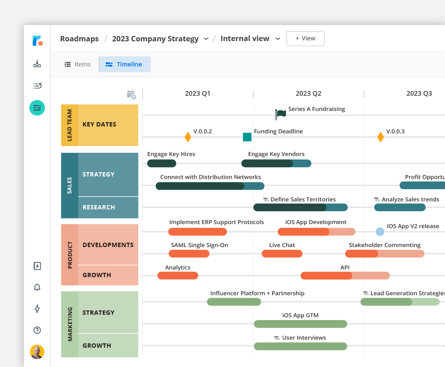
Source: Roadmunk by Tempo
How does a PERT chart work?
A PERT chart shows tasks and their dependencies, using the following components to visualize your project:
- Nodes represent project tasks and milestones — typically in the form of circles or rectangles with descriptions inside.
- Arrows represent item dependencies, so an arrow pointing from task A to B signifies that the assignee can’t begin task B until task A closes.
- Concurrent paths showcase items that co-occur, using parallel arrows between nodes as symbols.
- The critical path is the most efficient sequence leading to project closure, and a linear movement of arrows between nodes from start to finish represents this path.
- Start and end nodes represent the project’s beginning and end.
- Time estimates for each item determine its optimistic, pessimistic, and most likely completion date.
Together, these elements provide a visual display of the project, giving managers and teammates the information needed to plan and execute it.
The pros and cons of using a PERT in project management
On top of planning assistance, PERT charts offer project managers the following benefits:
- Better stakeholder management: Project managers can use these quick-picture charts to gain approval and update stakeholders on progress.
- Improved teamwork: Employees can quickly update and view these charts to better understand task progress, reduce time spent asking around for updates, and offer managers more performance visibility.
- More preparedness: Managers can use PERT charts for proactive scenario planning, as this tool helps identify potential problems coming down the pipeline, giving managers time to respond appropriately.
Despite the benefits, these charts don’t suit every team and project type. Here are a few disadvantages:
- Too data-reliant: PERT charts are only as good as the data used to create them, so you’ll need to find accurate and relevant information to create a high-quality plan and effectively monitor progress.
- Labor-intensive: Developing and maintaining PERT charts can be time-consuming and resource-intensive, and not all organizations have the resources or dedication to invest in this process.
- Requires regular updates: PERT charts need regular reviews and updates to remain accurate, which some project managers might find frustrating.
Source: Roadmunk by Tempo
How to make a PERT chart in 5 steps
While you can make this as a simple physical flowchart, digital project management tools like Tempo’s Roadmunk offer valuable and extensive features. You can then keep it somewhere central for your team to update, making project tracking quicker.
Whatever method you choose, here’s a five-step guide to creating this chart type.
1. Break down the project scope
Start by defining your project’s scope, considering the following:
- Team members needed
- External stakeholder deliverable expectations
- Critical success factors
- Mandatory goals and “nice-to-haves”
2. Establish a sequence of tasks
Working from your project scope information, create a linear task and milestone timeline. Items might overlap, which is totally normal. The goal here is to clearly represent the general task progression plan.
3. Connect tasks
Now, use arrows to link the nodes — or tasks — together. You’ll likely have a few arrows connect the same task to another if there are dependencies.
During this process, watch out for potential workload bottlenecks or milestones that rely too heavily on completing “nice-to-have” tasks you might not get to. Make adjustments to items and overall project deliverables as necessary.
4. Estimate task times
Working with your team and looking at past project times (you can look at previous reports if you use a tool like Timesheets), determine accurate task times.
The PERT chart formula can also help you find a weighted average for task durations: (O + 4M + P) / 6.
- O = Best-case time (optimistic estimate)
- M = Most likely time
- P = Worst-case time (pessimistic estimate)
Use a project management program with a built-in calculator to save time using this formula.
5. Create a critical path timeline
To create ideal and flexible overall project timelines, conduct a critical path analysis — this illuminates the shortest timeline you can take to hit all essential milestones. Then, determine slack for each task. Those with greater slack can handle delays without impacting the project timeline.
Source: Roadmunk by Tempo
A PERT chart example
Here’s an example to illustrate the concept, using an app development project. Following a systematic PERT approach, they visualize their work as follows:
- Listing tasks: They start by jotting down the tasks required to create the app, listing coding tasks, testing specs, and product launch requirements.
- Connecting the dots: Next, they draw lines connecting items logically. First comes wireframing, then coding, and finally testing.
- Estimating timelines: Certain coding tasks are easy and only need a day or two. Others could take weeks — even months. The project manager marks each task with three timeline estimates: optimistic, pessimistic, and most likely.
- Formatting: The app developer uses project management software to streamline the chart creation process, placing tasks on a digital timeline and adding arrows to show connections.
- Determining the critical path: Finally, the manager looks at the most essential tasks and crafts a direct-route plan to achieve their optimistic timeline. Where there’s slack, they adjust their focus to the project’s most critical items.
PERT charts versus Gantt charts: What’s the difference?
Both PERT and Gantt charts are popular tools for project and stakeholder management, but they satisfy different use cases.
| Aspect | PERT chart | Gantt chart |
|---|---|---|
| Style | Flowchart or network diagram. | Bar chart. |
| Scope | Designed for larger and more complex projects. | Suitable for projects of all sizes. |
| Timing | Used before project planning. | Used during and after project execution. |
| Scheduling | Helps in figuring out task scheduling. | Highlights scheduling constraints. |
| Dependencies | Dependencies appear within the network. | Dependencies appear using connectors between bars in the timeline. |
| Editing | Less editable during execution due to complexity. | More editable during the project’s lifecycle. |
| Duration | Focuses on estimating task durations. | Uses bar lengths to display task durations. |
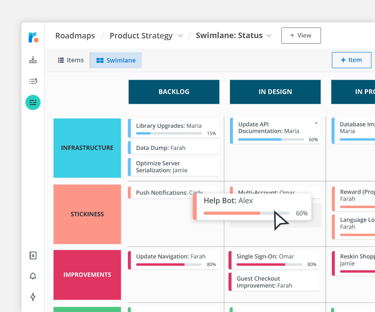
The benefits of using digital tools to create PERT charts
Digital tools make creating and sharing PERT charts exceptionally easy. They also offer project managers the following benefits:
- Interactivity: Managers can zoom in, set reminders, and link tasks to emails.
- Real-time updates: Before, making changes meant redrawing the chart. Now, updates are instant and shared with the team in real time.
- Streamlined teamwork: Modern tools let teams work on a PERT chart together. Everyone can add notes, suggest edits, and highlight issues.
- System integrations: Most digital PERT charts integrate with other project management software, and you can link tasks to outside tools like calendars and billing systems.
- Cloud access: Thanks to cloud storage, managers can access PERT charts from anywhere, and updates sync across devices and teams to keep everyone aligned.
Prioritize tasks like a pro with Roadmunk by Tempo
Turn your PERT chart into an interactive and easily customized project roadmap with Roadmunk by Tempo, using this map to track progress and notice delays throughout the project’s life cycle. Then, share it widely and encourage every stakeholder involved to check in and update it often. Sign up today.